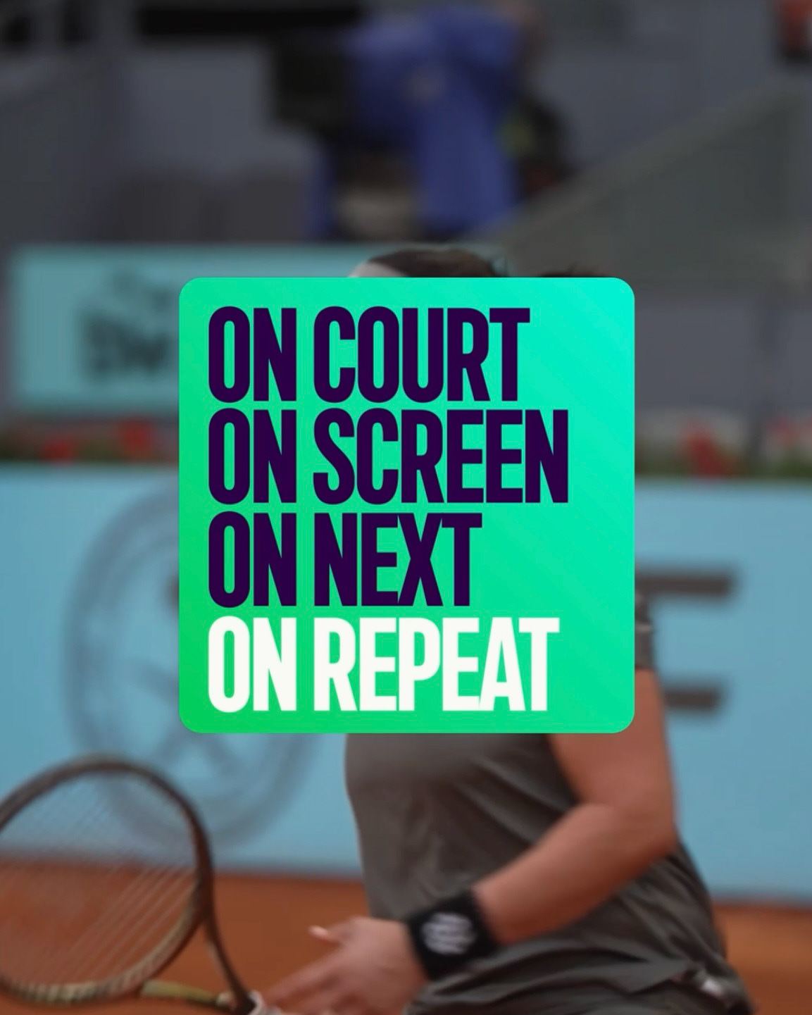
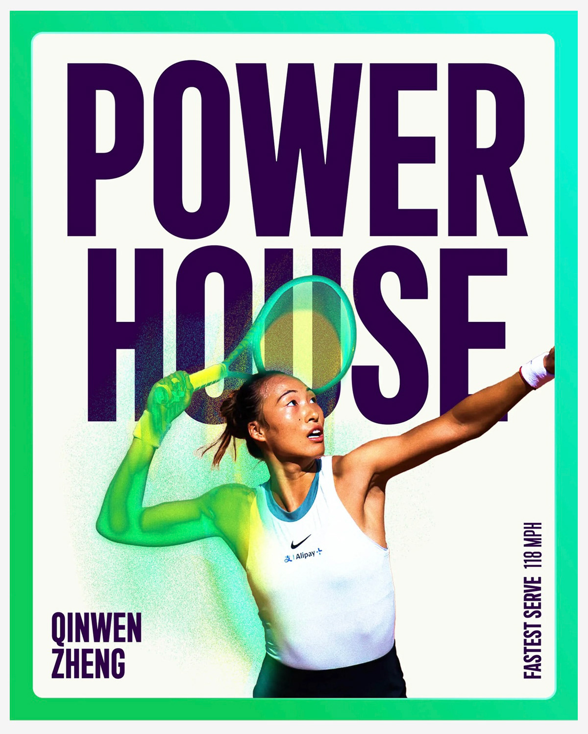

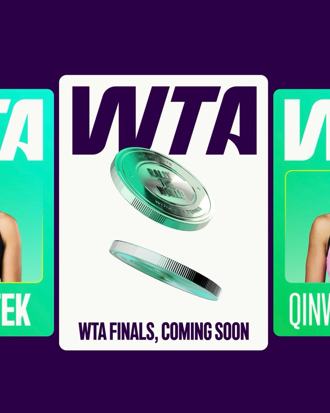
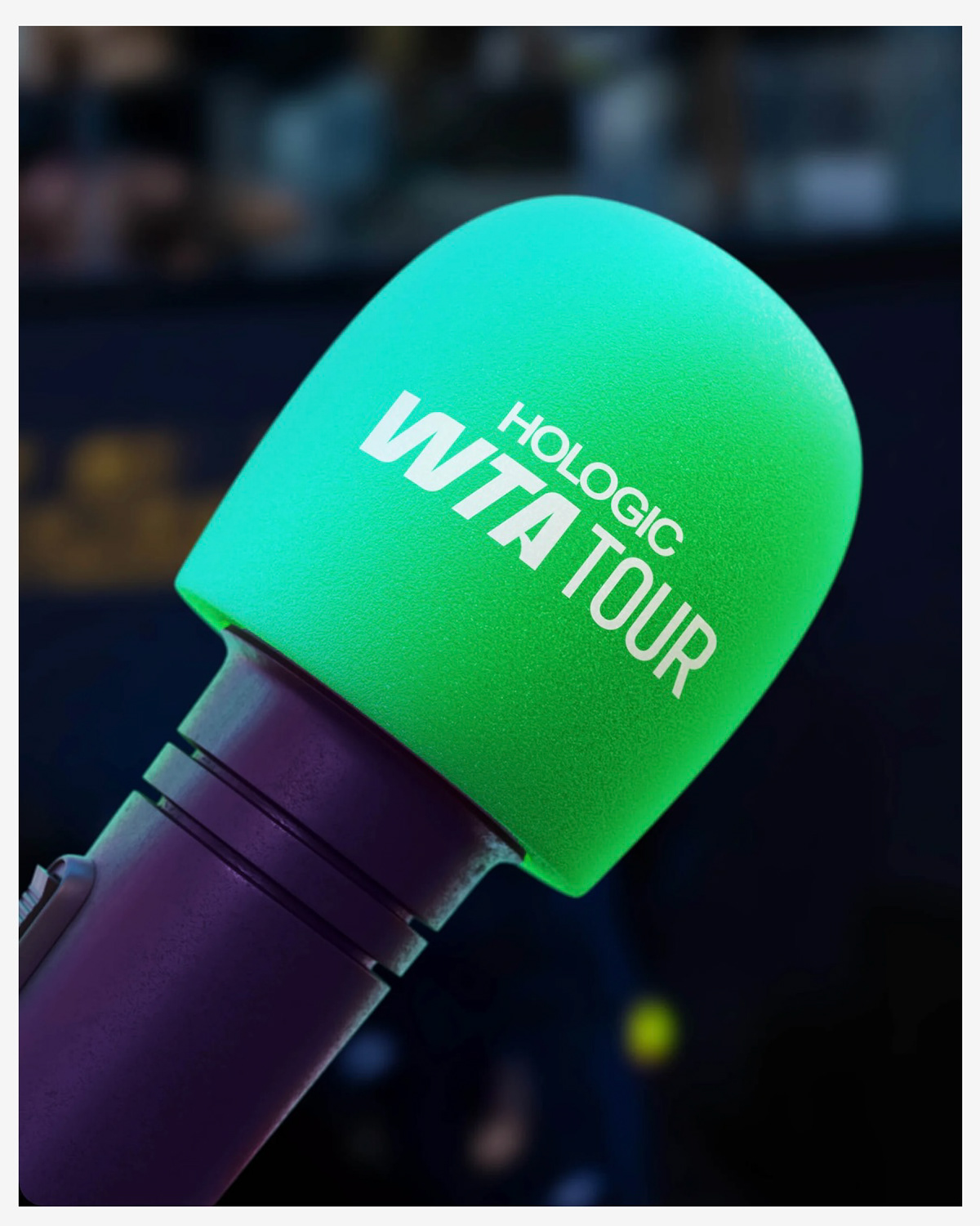
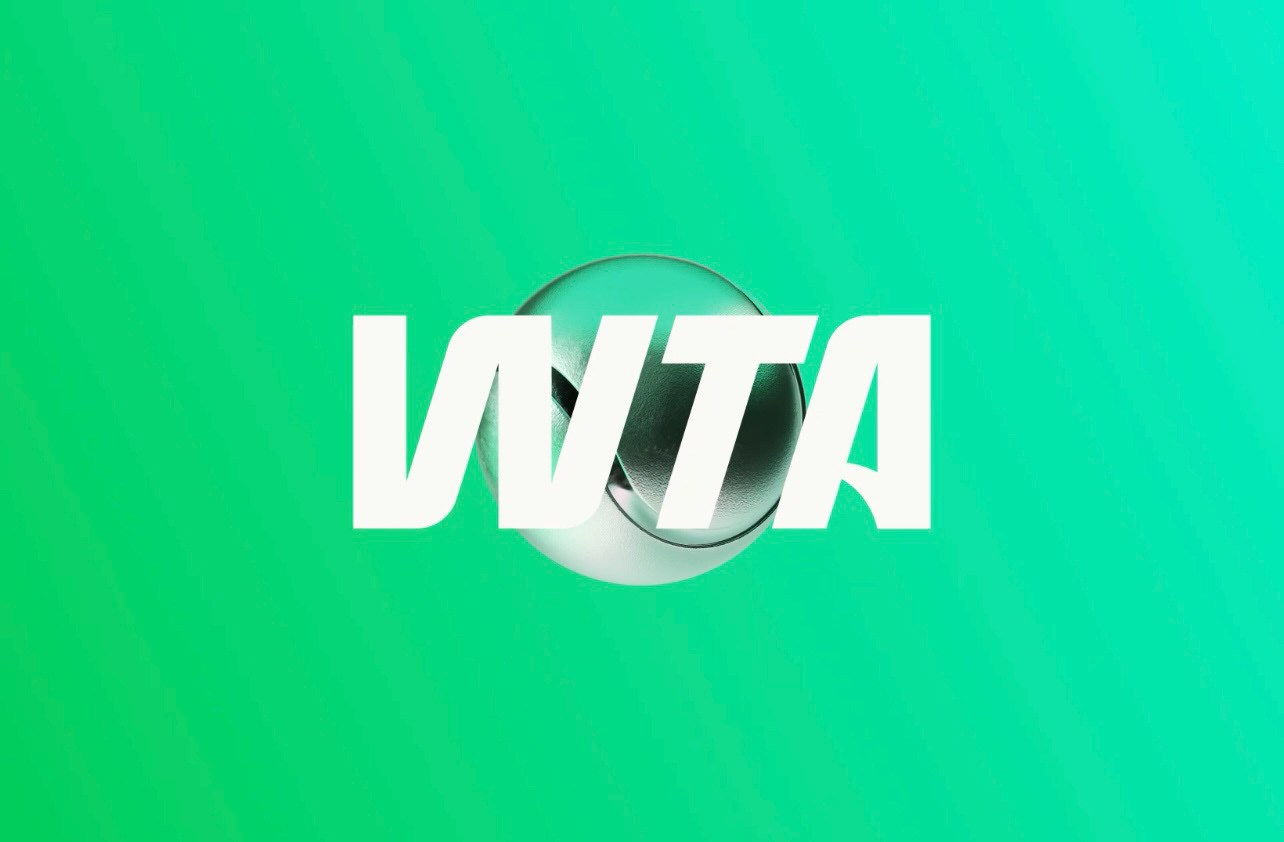
WTA Women’s Tennis Association 2025 Rebrand Marketing & Creative Collaboration Tabitha played a key role in the WTA’s 2025 social media rebrand, leading strategy while working closely with the team to craft content and campaigns that resonated with modern audiences. She directed the rollout across platforms, supporting the launch of the new WTA logo and branding assets to maximize visibility, engagement, and brand impact.